The term “ubiquitous” is defined as “existing or being everywhere, esp. at the same time; omnipresent.” Ubiquitous perfectly describes the humble writing implement known as the Crayola Crayon.
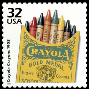
The depicted postage stamp was released in 1998, graced with an illustration of an early-20th-century Crayola box. This shows that kids have been playing with Crayolas for over a century, making the pigmented wax writing implements ubiquitous in the truest sense of the word.
Binney and Smith, a company that specialized in industrial pigments, released the first box of eight Crayola crayons containing red, orange, yellow, green, blue, violet, brown, and black sticks in 1903. It sold for a nickel.
The brains behind Crayolas (the name was dreamed up by Alice Binney, wife of one of the company’s founders) realized that kids would delight in drawing and coloring with them. They would also likely ingest them in the process. Therefore, Crayolas were made of non-toxic materials.
Thus did they arrive in my hands sometime in the early 1960’s. I don’t remember my first box of Crayolas, but, like most kids, coloring was one of my first artistic activities. I was probably three or so, just old enough to be somewhat trusted not to eat the delicious-smelling creations.
 Seriously, is there any more intoxicating aroma than opening up a shiny new pack of Crayola Crayons?
But, of course, it wasn’t all joy for Boomer kids when it came to Crayolas.
The first thing that would happen is that the more popular colors would wear down. That would lead to using, say, raw umber to color a tree trunk instead of brown, which was showing wear and tear (as in tearing the paper sleeve back a bit).
The more fortunate among us had the 64-color box that had that sharpener in the back. Thus, a reasonable facsimile of the pristine pointed tip that adorned a brand-new Crayola could be produced. The rest of us had to make do with using a dull crayon’s sharpest edge for fine details.
But sooner or later, time would catch up with every new box of crayons, and they would be reduced to shortened, war-wounded shadows of their former selves.
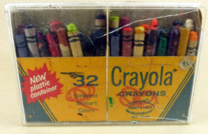
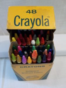
 So many of our boxes of Crayolas looked like the image to the right: Once immaculate and beautiful, but now showing signs of struggles against coloring books that required vast amounts of yellow, dark blue, and black to create landscapes and such that would adorn refrigerators and schoolroom walls for an amount of time suitable for masterpieces of their caliber.
Eventually, popular Crayolas would become too short to go into the box. Then they would be relegated to a cigar box full of their brethren which would have all of their paper peeled off, to be used by laying the entire crayon down on the paper and creating a one-inch wide swath of, say, blueness for a vast sky.
Like us, Crayolas saw their share of having to change with the times for politically correct reasons. In 1958, in response to requests from schoolteachers, “Prussian blue” was renamed “midnight blue.” I’m not exactly sure what that was all about, unless there was a sense of anti-Teutonic prejudice in the air. In 1962, the color “flesh” was renamed “peach.” I guess that’s better than “Caucasian.” And in 1999, “Indian red” became “chestnut.”
The last color change is particularly PC. You see, “Indian red” is a pigment produced in India and used in oil paints. However, since it could give the “wrong impression,” it was renamed.
Thus have Crayolas mirrored the Boomer generation. We are showing wear and tear, some of us more than others. We have had to make changes as society has demanded them. But we have also endured in pretty much the same easily-recognizable form that we have always had.
Could a postage stamp commemoration be far behind?